Plotting & Charts:
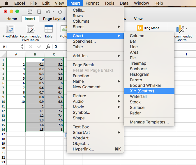
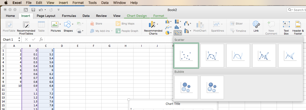
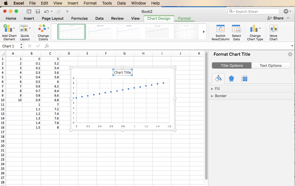
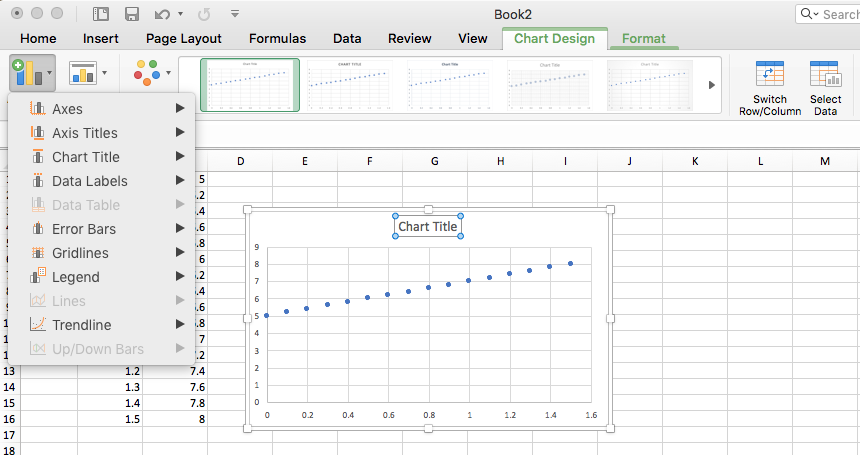
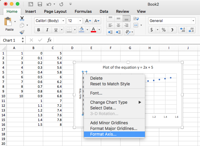
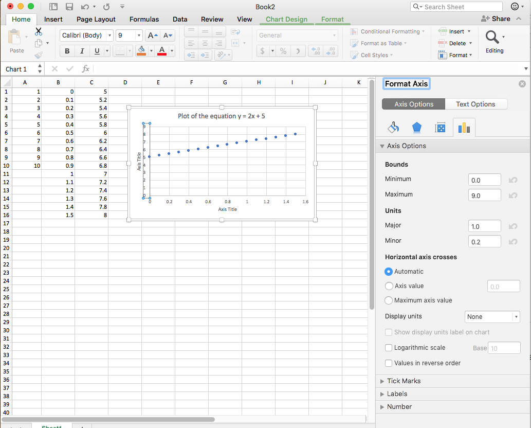
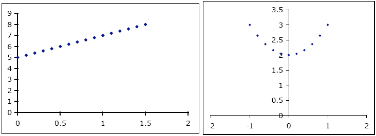
A useful way to view and present your data is with a proper graph, which provides a visual summary of your experiment. Historically, Excel has been very poor at producing scientific graphs, although the situation has improved considerably. Excel provides many different types of charts, which are primarily intended for business use. The chart type appropriate for calibration curves is the X-Y scatter plot. We will use this tool to plot the data generated in the preceding exercises for the equations y = 2x + 5 and y = x2 + 2. In the process, you will learn how to:
- produce simple graphs (exercise 1)
- specify titles, legends, and axis labels (exercise 1)
- change the axis numbering scheme (exercise 2)
- specify the correct number of decimal places (exercise 2)